Yesterday’s blog described Steve’s teaching on the use of acrylic transparently. The terms transparent, translucent and opaque are discussed in depth on page 43 of WaterMedia Painting with Stephen Quiller. Suffice to say that an artist can achieve some very interesting visual affects playing these techniques off of each other.
Please note – many of the photos appear backwards as they were taken in the overhead teaching mirror. The finished pieces are oriented correctly. Thank you to Janis Kestle and Joanne Edie for providing most of these photos.
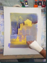
Saturday afternoon. Steve demonstrated the use of transparent and translucent color in a dockside demo. He used a transparent background wash of yellows which had been allowed to dry completely. Adding a small amount of white paint to a thin wash of 

After allowing us some time to work on our own we regrouped and Steve began a demo using transparent, translucent, and opaque acrylic on Crescent watercolor board. This is a very thick support relative to even the 300lb watercolor paper Steve had been using to that point in the workshop.
Steve had prepared the board with a neutral blue through violet tone and had allowed it to dry. After a very quick sketch Steve painted in 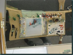
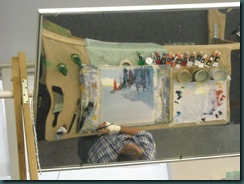

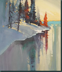
Steve wet the entire bottom section and painted the reflections by pulling straight down from top to bottom. He worked his magic on the details even here lifting out some areas and lightening others with the yellow/white mix. He described this as partly defining the 


I am in awe! You are right...watching a musical composer...I could sense that just by following along with the photo's.
ReplyDeleteWhat an amazing and wonderful experience.
I enjoyed this so much! Thanks
That was a very detailed review of your Quiller workshop experience. It seems you learned TONS. I took a workshop from Steve several years ago, and share your awe of this great artist.
ReplyDeleteI have all his books but due to your great account of your workshop you have made things clearer for me...thanks so very much for your reporting on the workshop. I can´t wait to take one myself!
ReplyDelete