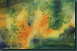
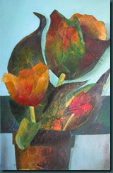
I’ve been working on this one off and on for a few days now. I’m keeping the colors almost analogous, but the flowers want a bit of that orange in them. This surface has a lot of molding paste texture in the background. My next step is going to be excavating some of the texture with my Speedball lino cutter. This will be my first attempt at this so wish me luck! I’m in an experimental mood – why not?
This blog documents my creative journey with watercolor, mixed media, & oil painting. I'm enjoying myself immensely and hope you find something uplifting in my paintings and/or their stories.
Tuesday, November 30, 2010
Sunday, November 28, 2010
I Don’t Think She Likes Me (acrylic, 11”x15”)

For those of you that are interested, the photo below was the state of the painting after the first painting session a few days ago. I kept only the three main sunflowers and noted that the two smaller ones seem a bit in awe of the “big girl”. They appear to be leaning towards each other and whispering. So, now you know the crazy things that are running around inside my head, haha! I quite enjoyed working the background transparently, then translucently and finally, in the upper right corner, opaquely.
Saturday, November 27, 2010
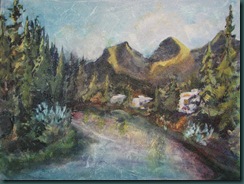
Camping at Three Sisters [acrylic on canvas, 12”x18”]

Friday, November 26, 2010
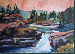
Elbow Falls [11”x15”, acrylic]
Thursday, November 25, 2010
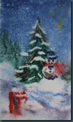
Frosty [watercolor monoprint on BFK Rives paper]
Last year I used watercolor paint straight from the tube and plastic Yupo “paper” to build a monoprint plate of this snowman. I’ve had it tucked away in my studio. Yesterday I scrounged up a piece of BFK Rives printmaking paper and processed the print. However, a quick read of my blog post from last March 16 would have been a good idea – I forgot to blot the paper before printing. As a result of the extra water, this print is a little blurry… it adds to the snowy feel though so I don’t mind it. Here are the images:
Watercolor on Yupo plate Print –muzzy as you can see!
This is what’s left on the yupo paper after the print.
Happy Thanksgiving to my USA friends and family!
Tuesday, November 23, 2010
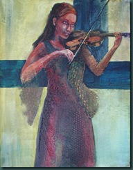
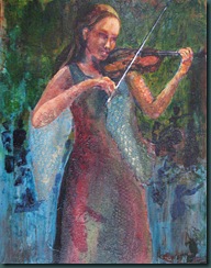
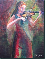
The development of a figure painting… Swing Song again
Today I puttered on a couple of paintings including my violinist. She’s been in the pile an awfully long time and, as I looked at the variety of photos I’ve taken of her, I can see some interesting developments. So, here’s a look back in time.
Today, after another 90 minutes of puttering, she looks like this:

The signed version below had a very choppy background which I kind of liked at the time but I’ve since changed my mind. I bought some absorbent ground a while ago and recently I decided to experiment a bit on this painting. I put two coats of the stuff on the background and, once dry, I laid in very light transparent washes. Once dry I added the dark green bands you see above. WOW! That’s some kind of interesting acrylic medium. It absorbs so much that it’s almost like 300lb watercolor paper… some interesting things happened with all the hills and valleys on the surface.
Sunday, November 21, 2010
If You Could See Me Now [14”x11”,acrylic on canvas]
I’ve had another go at the colors on this painting. Mostly I’m going back into this one to try to help me work through missing my brother. This painting speaks to me of Chuck’s continued presence in our lives through the veil. I know his spirit lives on.
I believe that at times he is aware of what’s going on as part of “the great cloud of witnesses” cheering us on to victory in our lives. He’s much more able to intercede on our behalf from there. He’s also busy learning all the ropes up there and Kiya [she’s just coming up to her 2 year birthday] has got Papa on a steep learning curve I’m sure! Lots of people to show him around to. I can imagine how wonderful it was for him to finally hold that little one in his arms. I can imagine him sitting around visiting with those that have gone before and enjoying their company.
If I asked him if he’d rather be here with us I can imagine him saying “sometimes sis. But, you’d be glad for me if you could see me now”. Well, I am glad for him… just not so much for the rest of us. But, this week I promise to work a bit harder at entering into the Christmas spirit. Have a great week!
Saturday, November 20, 2010
Bowness Buddies [22”x30”, acrylic]
I’ve resolved many of the issues with this painting and I’m [definitely] ready to move on to another one. I’m really liking my doggie in this painting – she’s kind of a large version of my Kassie. She loved Bowness Park… ah, we had some good times together there, that’s for sure. Enjoy!
Friday, November 19, 2010
Bowness Buddies WIP [22”x30”, acrylic]
So evolves a painting… try to fix the 4 things you didn’t like and create a few more in the process ;-) Oh, and while you’re at it HURRY and take blog photos before the sun goes down – at 4:30 pm. First , it would do me goo to say what I LIKE about this painting:
- I’m still liking the bridge – it’s been glazed a bit darker and that’s working.
- I now like the sky – the bigger shape is still a triangle but the gradation helped even though it’s subtle.
- I toned the value of the rocks on the left down and extended them toward the bank… that’s better. The trees on the bank extend above the deck of the bridge now too.
And now we get the inevitable next steps:
- The hat needs help. Once I get the shape right I will…
- Get the get the lights back on the right side water and sand.
- The trees on the far right bank are too warm/light.
- Bump the gradation in the sky a bit further???
Otherwise just puttering…. Oh, the joy of acrylics – it’s never really over!
Thursday, November 18, 2010
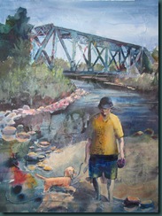
Bowness Buddies [22”x30”, acrylic]
I’ve kept a bunch of the texture from the original acrylic ink start. Due to the darkness of the start I decided to select a subject I could work abstractly. The railway bridge has plenty of graffiti on it and I wondered how it would look to paint the bridge negatively and leave most of the color and texture as the bridge. So, I’m pretty happy with the bridge.
Still on the list after looking at this in thumbnail size:
- My man looks really dull in the figure. I’ve got to work on that a bit. He also looks sad. What’s with that? Shouldn’t he be a happy camper wandering around Bowness Park with his buddy in the SUMMER? Hmmm.
- The sky shape in the top right is about as boring as shapes get. That’s got to change.
- The rocky shore curves way too smoothly as it goes under the bridge. It makes the shape of the water too static.
- I’m missing the bits of overlap in the brush in front of the left side of the bridge - it’s causing a perspective issue.
Stay tuned…
Wednesday, November 17, 2010
Elbow Falls [acrylic, 11”x15”]
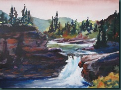
This acrylic on 140 lb watercolor paper was started transparently and then worked back into with translucent and opaque paint. The eye sees transparent against opaque very differently. This is clear in the waterfall… I did the furthest left water first and then painted the right most water opaquely on top. The closer opaque water comes forward as I’d hoped it would. Enjoy!
Monday, November 15, 2010
Three Sunflower Sisters start [acrylic, 11”x15”]
I started this transparently today and it was fun. I’m really into the split compliment created by Pyrrole Orange/Phthalo Blue & Green Gold/Dioxazine Purple. I think a fairly realistic array of colors can be created if one wishes to work realistically. But, there is still plenty of scope for the imagination. Abstracting a subject’s color is lots of fun and a definite stretch for the imagination. I hope to find some hard evidence one day to support my premise that puddling around in bright colors is good for one’s mental health. I have anecdotal evidence that says it’s so.
I am working my way into quite a pile of these starts. My plan is to work on several concurrently and, eventually, move them closer to finished. Hope springs eternal!
Sunday, November 14, 2010
Chaos again…
I’ve had these Daler-Rowney FW acrylic inks for a while but haven’t used them much at all. Last night I wanted to play with something new so I took 3 bottles of ink and my water atomizer and went to work on this full sheet of 300 lb watercolor paper.
I dampened the 300 lb paper and then applied the inks straight from the dropper. I continued to spray and tilt the paper from side to side to get the inks to run and spread… possibly a bit too much. The inks are really quite beautiful as they run and drip and blossom on the paper. Perhaps I am easy to entertain, lol. Lots to do here still. Stay tuned!
Saturday, November 13, 2010
Marketing Trial on Etsy
I’ve been looking into opportunities for marketing my art for a while. Some of them require a heavier commitment to activities other than painting. They are bricks and mortar exhibits, markets, etc. that require physical attendance and, while I like that in limited amounts, I can’t afford the time to do much of it. Since I have limited energy and time due to some health issues, I need to find a way to market that allows me to continue to make art at the same time. What better way than a 24/7 store on the universal marketplace… the WWW!!!
After reading a few reviews and many adverts, I have decided to give Etsy a try. Etsy.com is a company offering a platform connecting buyers and sellers of handmade products. I like their mission and vision:
Our mission is to enable people to make a living making things, and to reconnect makers with buyers.
Our vision is to build a new economy and present a better choice
It’s easy to set up and maintain and lots of other artists have had success selling there. My own experiment is underway and will be for many months to come. Check it out on Etsy… see you at the mall!
Friday, November 12, 2010
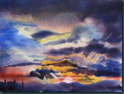
Sunset – transparently
The goal was to stay transparent with this painting. I’ve done that but BOY do I miss the ability to add punch with the opaque. This was a messy, complex sunset and the intriguing thing for me were the streaks in the clouds. I’ve captured a bit of that here. Enjoy!
Thursday, November 11, 2010
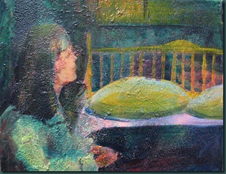
Night Prayer [acrylic on canvas, 9”x12”]
Happy Remembrance Day and Veteran’s day. Tonight my night prayers will include a lot of thanksgiving for the safe homecoming of Captain Matthew Quist from Afghanistan. I’m also thankful for the men and women who gave the ultimate sacrifice to keep Canada free.
This canvas started out on November 4 as the monochromatic greens over heavy texture [Golden coarse pumice gel]. That surface is a challenge to paint… acrylics tend to bubble when dragged over this rough stuff. The paint puddles and absorbs and runs and does all kinds of unexpected stuff – fun! I’m not done this so stay tuned!
Wednesday, November 10, 2010
Don’t Grouch, Just Wait [digital art]
It’s been another interesting week around here. Yesterday I went to the curator’s tour of the Fernando Botero exhibit at the Glenbow Museum - good thing – yay!] I really enjoyed seeing so much amazing art in one place! He says so much with his art… it’s hard to take it all in.
However, recently our Grandson Ethan [6] has been feeling rough and the docs continue to try to figure out why – very bad thing – boo! The next step is a biopsy on one of his lymph nodes next week. Matthew [our Canadian Forces Captain son] is on his way home from Afghanistan to be with his family. When I was a kid I had a benign tumor removed from the right side of my neck so I’m counting on this one being the same. So we wait… and we pray…
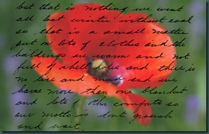
Today I came across some copies of letters and postcards that my Great Grandpa Mac wrote home in 1918. I did this simple remembrance day digital piece with a public domain poppy and part of a letter he wrote home.
So let me set this up for you: Mac was in France recovering in hospital from wounds he sustained in the 2nd battle for Amiens and he’d been in Europe without a break since 1916!!!! The hospital had no coal for warmth [it’s cold in late October] and few blankets and yet his words are inspiring!
He says “…we went all last winter [in the trenches] without coal so that is a small matter. Put on lots of clothes and the buildings are warm and not full of shell holes and there is no lice and mud and we have more than one blanket and lots of other comforts so our motto is DON’T GROUCH AND WAIT!” I have so much more to be thankful for and I chose to do just that. I shall not grouch and I will wait!
Happy Remembrance Day Canada! Thank you to all the “great cloud of witnesses” that served our country and gave their lives. And THANK YOU to those of you that are still serving! A big hug out to my own special hero – Captain Matthew Victor Quist of 2 Regiment based in Petawawa, Ontario.
Monday, November 8, 2010
Sunset WIP [acrylic on w/c paper, 11”x15”]
Puttered on this today… the goal of this exercise is to use acrylics like watercolor. The most important thing is to save the white. As you can see I’m in deep here with respect to the MOST important thing!!! However, I do like some aspects of what is happening here… I’ll repost after I’ve worked on it again. It should only take me another 10 minutes to cover up ALL the rest of the white space [tongue firmly planted in cheek, eyes rolling].
Enjoy!
Sunday, November 7, 2010
Freedom [16”x12”, acrylic on canvas]

Saturday, November 6, 2010
If You Could See Me Now [acrylic, 14”x11”]
I took a painting that I was thoroughly disgusted with and covered it with white gesso [again!!!]. This one was “Good Jumpers” from October 19 in it’s most recent life.
Today I glazed several layers of acrylic paints over the heavily textured white surface and experimented with a few ideas. But, in the end I couldn’t get Chuck off my mind. I’m also thinking lots about my brother Harvey who is in Haiti right now. Harv has a photo of Chuck as his Facebook profile picture from their trip to Haiti this past February. I wondered what would happen if… and the next thing I know I had contact paper over a blow up of that photo of Chuck and was cutting out a mask. I used the mask and painted the landscape around that shape. I kind of like it. It reminds me that he is in my life still – just not how he was before. Ciao!
Thursday, November 4, 2010
Starts, ideas, and planning…
Today I planned, puttered, and started a few pieces - two starts on watercolor paper, two on canvas, and one on baltic birch. All but one of these starts is going to be worked abstractly at first. I have precious few concrete ideas so working this way seems logical. Somehow it seems “right” that I am working my way from chaos through to concrete – it mirrors life. Life is messy, art reflects life. The process of allowing myself to work creatively within the chaos is somehow rewarding for me… So, we shall see how these work out over the next few days and weeks.
Three of the starts are shown below… the color choices are deliberate… green reminds me of life and peace, yellow represents hope. Ciao!
Wednesday, November 3, 2010
Famous [22”x15”, collage & mixed media]
I put this collage together using tissue paper stained with fluid acrylics. I tore pieces from the paper that were tulip-like colors and pasted them on to a watercolor paper previously stained with acrylics and on which I had stamped purple and green. After the collage was dry, I painted into it extensively.
In this case, the base [below] doesn’t appear to make much difference – you can see only a little bit of it in the dark band in the background. However, the support reminded me of the collage papers, which reminded me of tulips, which got me working towards this. I’ve been struggling to find inspiration lately so finding inspiration from a “start” like this is critical. Enjoy!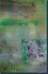
Tuesday, November 2, 2010
Spring Bouquet [acrylic. 14”x10”]
This was painted using an interesting technique from my mixed media class yesterday. I started with splattering watered down fluid acrylic paint [Golden] over a piece of watercolor paper. Most of the surface was covered in this way. When that dried, I used chalk to sketch the subject, being careful to make interesting negative shapes behind the flowers.
Next I used juicy opaque yellow paint on the background and voila!!! out popped the flower and table shapes. A translucent [white and blue/green] paint was used to define the glass vase. I then puttered with the flowers to define them better but left some of the dots and white paper showing through. Then I painted a transparent reddish glaze [lots of water added] over the table area. Once dry, I put the shadow in.
I finished this at 2am and I am unrepentant!!! I’ll get my days and nights straightened out eventually. Really… I WILL! Ciao.


